

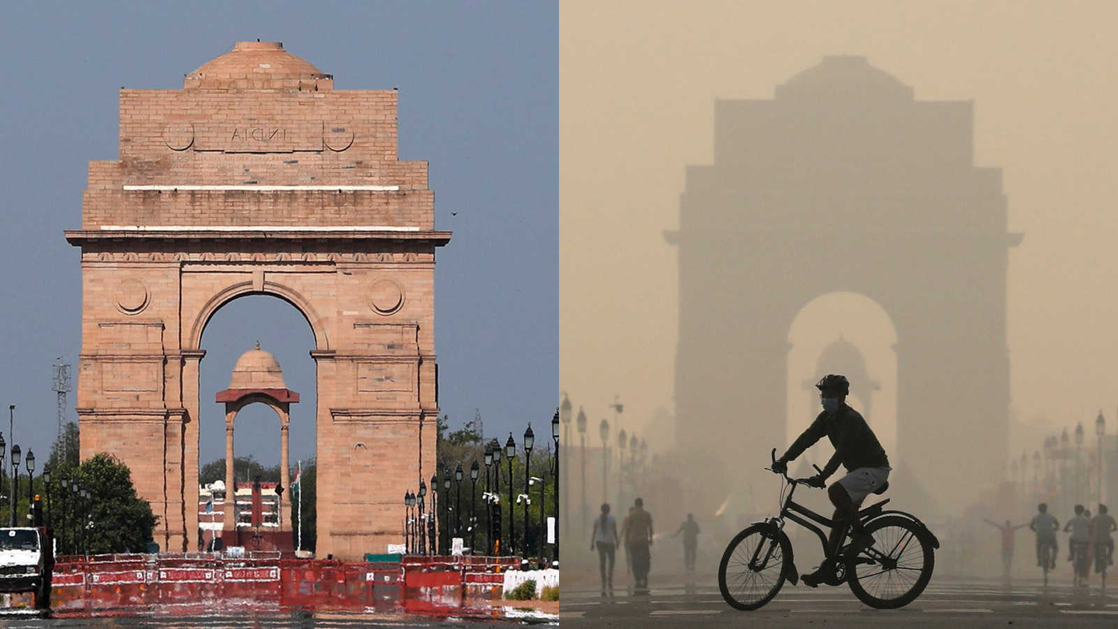
Before and After photos were one of the few positives of lockdown. Pollution sucks colour from our lives – literally. Now imagine how hard life is, for people with permanent disabilities that affect vision?
I create Websites That Work, and accessible websites are good business. Accessibility NOT just a legal and social hassle to accommodate disabled people, user-friendly is better for ALL of us!
Improve contrast – but not too much
Words need a definite background and foreground. I could get technical about contrast ratios, but most of it is common sense.
Too MUCH contrast can be as bad as too little. I rarely use #000000 (black) with #FFFFFF (white). I take the black up one tone so shadows show, and page backgrounds are a very light grey (which also helps white panels stand out!)
For decades, I was taught white on dark text is unreadable. But on a phone, white text on a dark background works better for ME. Too much white glows and forms halos.
There are online contrast checkers to verify the contrast of your color choices for your corporate palette.
Upgrade colour-only formatting
It isn’t enough to put critical information in red. Add bold or capitals. Adapt the font. Add an icon. Make sure calls-to-action have clear and multiple cues.
Avoid colour-only navigation. Add an underline, a hover background, something that makes the hover obvious. Don’t be subtle about the “hamburger” icon ☰ – it needs styling too (sometimes designers forget because it only shows on mobile).
Allow for colour-blindness
Red-Green colour blindness is more common than you think – it affects up to 1 in 12 males (so that’s 8% of your customer base!) And your ability to see color also declines with age.
Pay particular attention to tables, graphs and diagrams. When pie chart slices are next to each other, give a light/dark or bright/dull difference. Use labels. I personally dislike patterns because they shimmer.
Pay attention to text on photos
If I have text on photo captions, I give the caption a tinted background – perhaps 50% transparency.
Choose banner images with either very little detail, or large open patches of flat colour. Check that the photo resizes sensibly on mobile, and the text stays visible. Consider removing the background image for mobile screens.
Avoid textured backgrounds
In the 90’s I designed lots of website with fake paper backgrounds. Unless you want a retro feel, don’t make the same mistake!
Build a website that works for everyone
Embrace the power of color responsibly. Aim for a design that is not just beautiful, but also inclusive and accessible. A website that works well for customers, works harder to grow your business!
